
 by
by Every detail matters! One can’t simply ignore the power of colors. They’re your brand’s first and foremost component. To rephrase that, you call someone an “affluent individual” because of their money and status. Similarly, your logo has an abundant supply of value. It’s the same value that you need to elevate your business.
When you assume the role of an entrepreneur, you’ll not only sell your product or service. In fact, you’ll be selling an experience and a lifestyle. To make it happen, you can avail colors. These are among the most powerful tools at your disposal. They have the ability to convey your message, evoke emotions, and establish an identity.
Contents
Picture This …
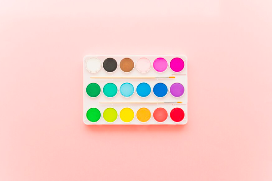
You’re strolling down a busy street. Amidst the sea of storefronts, there’s a shop that catches your eye. The colors are vibrant yet harmonious. The colors are drawing you in with an irresistible allure. That’s the magic of a well-crafted color palette. It has the potential to captivate, to intrigue, and to make your startup stand out in a crowded marketplace.
So, how do you harness this potential to propel your startup to marketing success?
Let’s delve into the art of color palette design. Today, we’ll uncover the secrets to creating a visual identity that resonates with your audience.
1. Understanding the Psychology of Color
Color psychology is a fascinating field. It explores the impact of colors on human behavior and emotions. Every hue carries its own symbolism and sends a unique message.
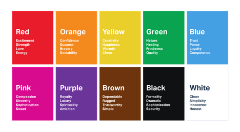
Source: LinkedIn
For instance, blue exudes trustworthiness and professionalism, making it a popular choice for financial institutions and tech companies. On the other hand, red signifies passion and energy, making it ideal for brands that wish to make a bold statement.
By understanding the psychological relations of different colors, you are able to select hues that align with your brand values and goes well with your target audience.
Remember, the goal is not just to choose colors for logo and brand randomly. You must use them consciously to evoke the desired emotional response.
2. Crafting a Cohesive Color Palette
Once you have a grasp of the psychological nuances of color, it’s time to create a cohesive color palette. Keep in mind that it should reflect your brand identity.
Start by selecting a primary color that embodies the essence of your brand. It’ll serve as the foundation of your palette, setting the tone for your visual identity.
Next, choose two to three complementary colors that complement the primary hue. Progress forward and add depth and contrast to your palette. Consider factors like hue, saturation, and brightness to ensure harmony and balance among the colors.
Experiment with different combinations until you find the perfect balance. The perfect balance refers to the spirit of your brand.
3. Testing and Iterating
Creating a color palette is not a one-time endeavor. Rather, it’s an iterative process. After you develop a preliminary palette, it’s vital to test it across various touchpoints to gauge its effectiveness.
- How does it look on your website?
- Does it engage your target audience on social media?
- Does it convey the desired message in your marketing materials?
Gather feedback from your audience and stakeholders. Be open to adjusting based on their input. Don’t forget that your color palette is supposed evolve and grow with your brand. If it’s not reflecting changes in your values, offerings, and market positioning, there’s something wrong.
4. Consistency is Key
Consistency is key when it comes to branding. Here, your color palette plays a crucial role. Whether it’s your website, social media channels, packaging, or advertising materials, make sure that your colors are used consistently. The purpose of consistent use of colors is to strengthen your brand identity, as well as create a cohesive brand experience.
By adhering to a consistent color palette, you improve your brand recognition and build trust with your audience. They’ll come to associate your colors with your brand values and offerings. As a result, it’ll become easier to cut through the noise and make a lasting impression in the minds of consumers.
5. Harnessing the Power of Contrast and Accessibility
While creating a color palette, it’s important to consider aesthetics in addition to accessibility. Accessibility assures that your visual content is perceivable and usable by everyone. “Everyone” even includes those with color vision deficiencies. The best way to achieve this is by harnessing the power of contrast.
Contrast is the difference in luminance or color between different elements in a design. If you incorporate enough contrast between text and background colors, you’ll enrich readability, guaranteeing that your content is accessible to every Tom, Dick, and Harry.
Moreover, contrast is used to draw attention to key elements of your design, such as calls-to-action or central information. When selecting colors for your palette, study their contrast ratios and how they’ll appear to your target audience with changing visual abilities.
Tools like the Web Content Accessibility Guidelines (WCAG) provide recommendations for contrast ratios to prioritize compliance with accessibility standards.
6. Evoking Emotion through Color Storytelling
Colors are supreme! You know that now. They evoke a wide range of emotions and connections. Since they’re emotion-inducing, it makes them a potent storytelling instrument for startups and big businesses. If you infuse your color palette with narrative and meaning, you’ll form a deeper connection with your audience and communicate your brand story more effectively.
Think about the story you want your brand to tell
Are you a disruptive innovator challenging the status quo, or a trusted advisor guiding customers through life’s complexities?
Whatever your narrative, your color palette can help bring it to life.
Ponder over the story behind all the colors in your palette.
How does it reflect your brand’s personality, values, and mission?
For example, a natural, earthy palette might evoke feelings of authenticity and sustainability, perfect for a wellness or eco-friendly brand.
On the flip side, a vibrant, energetic palette could convey a sense of excitement and dynamism. This is ideal for a youthful and adventurous brand.
Weaving a narrative through your color palette coins a multi-dimensional brand experience. This experience is sure to resonate your audience on a profound level. It doesn’t matter if it’s through nostalgic hues that evoke childhood memories or futuristic shades that inspire innovation; color storytelling enables you to unite with your audience emotionally and differentiate your brand in today’s jam-packed market.
Bottom Line
Mastering the art of color palette design is essential for startup marketing success. Understand the psychology of color because it’ll help craft a solid palette, test and iterate, and maintain consistency across all touchpoints, emphasize contrast, and evoke emotions.
You can create a visual identity that resonates with your audience, sets you apart from the competition, and drives business growth.
So, go ahead, unleash the power of color, and watch your startup soar to new heights of success!